With so many beautiful fabric choices for quilters today, picking the right colors for our quilts can be dizzying. But it doesn’t have to be. There are tools you can employ to help you confidently select colors for your next favorite quilt project. I limited myself to 6 tools for this post. I could have gone on and on. The more tools I researched, the more I found. Therefore, I assure you there will be a parte dós to this post. For now, let’s dive in!
1) Colorhunt.co
For coming up with color schemes on the fly, colorhunt.co is my favorite resource for selecting pleasing color palettes for designers of all types. I’ll bet they didn’t have quilters in mind when they started this site!


I love this website so much. The color combinations that appear are ones I would never think up on my own.

After choosing a scheme, then go play in your fabric stash and see what you already have on hand.

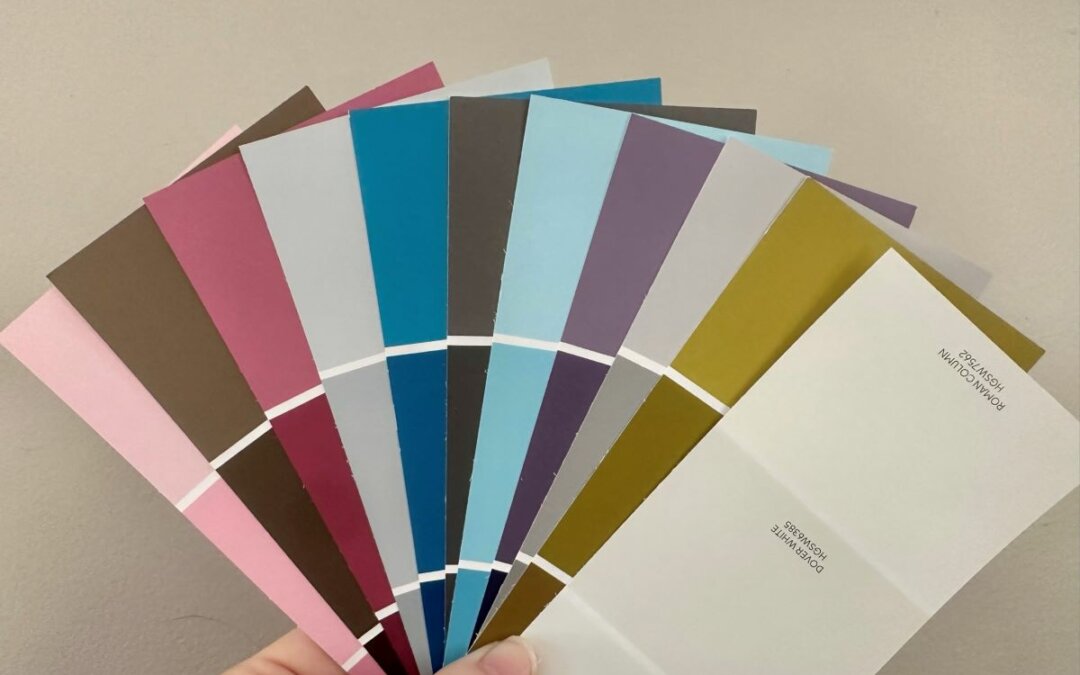
2) Paint Chip Cards
Let’s say you are not tech savvy, or you just want to use tangible resources for color help. Paint chip cards are great non-techy tool, while also light and portable. This makes them easy to hold up to your fabric stash and compare the colors for ultimate choices. You can also make decisions at home using the chips, then easily take them to the quilt shop to help you there. What’s more, you can take those handy catalogs from the paint displays showing how to put colors together for your home, but apply them to your quilts instead. Then maybe building a room color scheme around your quilt…I’m getting carried away.


Here, I’ve used paint chip cards against a print I like. The larger squares of colors found in the fabrics help me determine which colors I want to bring out from the print for the rest of my quilt. At the same time, the chip cards help me determine which colors I don’t want to feature.
I’ve even heard of quilt guilds using paint chip cards for “paint chip challenge” quilts. How fun! I even found this delightful article about one.

3) Nature
Perhaps our most beautiful color schemes are in our outdoor surroundings every day…nature! We may not take advantage of the natural beauty in our immediate surroundings every day. Such as our neighbor’s mailbox flower bed, a creek with sand, rocks, and leaves along our morning walks, a striking sunset on our commute home.

*Bonus if you can photograph a quilt or quilt block in the photo, like my favorite quilty photo above.


4) Palette Builder
Our photographs from nature are a perfect segue to my next point. I only just recently discovered the Palette Builder from Play-Crafts.com. It has changed my life! You can upload your own photo to the site. Then the site will automatically build a palette for you (which you can adjust) based on the colors in your photo. As if that isn’t cool enough, it will match those colors to Kona or Moda solids, and Aurofill threads.🤯I could spend days and days on this site!

The home page for the Palette Builder prompts you to upload your photo. Colors from the photo are automatically uploaded. The little circles on the photo are where the colors are chosen from. You can move those circles to pull other colors.

You can add or subtract the number of colors selected from the photo.
*Just an aside, Sherwin Williams has a similar tool here for uploading photos and choosing paint colors to match.
5) Artwork from Your Home
Draw color inspiration from paintings in your home. Artwork in your home is likely there in part due to the colors in it. Imagine a painting in your living room having a matching quilt over the back of the sofa? Much like decorating with a vase or pillow, a quilt is a delightful way to repeat a much loved color scheme in a room.

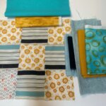
This mountain painting is arguably my favorite work of art in my home. I found it for $25 in a rural western North Carolina thrift store and eagerly brought it home with me to be framed.
In the bottom right corner you see the colors and fabrics I pulled, inspired by this painting. I would not have thought to combine these fabrics and colors without this painting.
See what happens when you play with your fabric stash in this way.

6) Color Wheel
It goes without saying, a color wheel is a valuable tool for any type of artist. I could write an entire blog post just on using a color wheel – and I will. 😉 A color wheel can help you choose multiple shades of the same color for a monochromatic look. An analogous color scheme can be easily envisioned by using side-by-side colors on the color wheel, such as yellow, orange, and red.

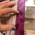
Choosing colors on opposite sides of the wheel can help you choose boldly contrasting schemes, such as magenta and chartreuse seen here.
Stay tuned for future blog posts where I dive much deeper into using a color wheel. In the meantime, get your own color wheel through my affiliate link here.
I had so much fun brainstorming many ways we are influenced by color. To conclude, I’d love to hear from you.
What tools have I mentioned that you have used with success? Tell me about it in the comments.
What tools have you used that I did not mention? I will be writing a Part II of this post, and I’d love to have your input.
